Let's say I have dataset within the following pandas dataframe format with a non-standard timestamp column without datetime format as follows:
+--------+-----+
|TS_24hrs|count|
+--------+-----+
|0       |157  |
|1       |334  |
|2       |176  |
|3       |86   |
|4       |89   |
 ...      ...
|270     |192  |
|271     |196  |
|270     |251  |
|273     |138  |
+--------+-----+
274 rows × 2 columns
I have already applied some regression algorithms after splitting data into training-set and test-set and got results like the following:
import numpy as np
import pandas as pd
import matplotlib.pyplot as plt

df = pd.read_csv('/content/U2996_24hrs_.csv', sep=",")
print(df.shape)

# Split the data into training and testing sets
from sklearn.model_selection import train_test_split
train, test = train_test_split(df, test_size=0.27, shuffle=False)
print(train.shape) #(200, 2)
print(test.shape)  #(74, 2)

#visulize splitted data
train['count'].plot(label='Training-set')
test['count'].plot(label='Test-set')
plt.legend()
plt.show()

#Train and fit the model
from sklearn.ensemble import RandomForestRegressor
rf = RandomForestRegressor().fit(train, train['count']) #X, y
rf.score(train, train['count']) #0.9998644192184375

# Use the forest's model to predict on the test-set
predictions = rf.predict(test)

#convert prediction result into dataframe for plot issue in ease
df_pre = pd.DataFrame({'TS_24hrs':test['TS_24hrs'], 'count_prediction':predictions})

# Calculate the mean absolute errors
from sklearn.metrics import mean_absolute_error
rf_mae = mean_absolute_error(test['count'], df_pre['count_prediction'])

print(train.shape)   #(200, 2)
print(test.shape)    #(74, 2)
print(df_pre.shape)  #(74, 2)

#visulize forecast or prediction of used regressor model
train['count'].plot(label='Training-set')
test['count'].plot(label='Test-set')
df_pre['count_prediction'].plot(label=f'RF_forecast  MAE={rf_mae:.2f}')
plt.legend()
plt.show()

According this answer I noticed:
if your data is already sorted based on time then simply use
shuffle=Falseintrain, test = train_test_split(newdf, test_size=0.3, shuffle=False)
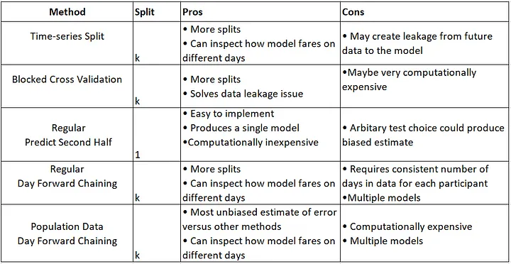
So far, I have used this classic split data method, but I want to experiment with Time-series-based split methods that are summarized here:

Additionally, based on my investigation (please see the references at the end of the post), it is recommended to use the cross-validation method (K-Fold) before applying regression models. explanation: Cross Validation in Time Series
I've tried recommended TimeSeriesSplit() as the following unsuccessfully:
#Try to split data with CV (K-Fold)
from sklearn.model_selection import TimeSeriesSplit
tscv = TimeSeriesSplit(
    n_splits=len(df['TS_24hrs'].unique()) - 1,
    gap=0, # since data alraedy groupedby for 24hours to retrieve daily count there is no need to to have gap
    #max_train_size=199, #here: https://stackoverflow.com/a/43326651/10452700 they recommended to set this argument I'm unsure if it is the case for my problem
    #test_size=73,
)

#for train_idx, test_idx in tscv.split(df['TS_24hrs']):
#    print('TRAIN: ', df.loc[df.index.isin(train_idx), 'TS_24hrs'].unique(),
#          'TEST: ', df.loc[df.index.isin(test_idx), 'TS_24hrs'].unique())


# Function modified from https://scikit-learn.org/stable/modules/generated/sklearn.model_selection.TimeSeriesSplit.html
import matplotlib
from matplotlib.patches import Patch
from matplotlib import pyplot as plt
cmap_data = plt.cm.Paired
cmap_cv = plt.cm.coolwarm

def plot_cv_indices(cv, n_splits, X, y, date_col = None):
    """Create a sample plot for indices of a cross-validation object."""

    fig, ax = plt.subplots(1, 1, figsize = (11, 7))

    # Generate the training/testing visualizations for each CV split
    for ii, (tr, tt) in enumerate(cv.split(X=X, y=y)):
        # Fill in indices with the training/test groups
        indices = np.array([np.nan] * len(X))
        indices[tt] = 1
        indices[tr] = 0

        # Visualize the results
        ax.scatter(range(len(indices)), [ii + .5] * len(indices),
                   c=indices, marker='_', lw=10, cmap=cmap_cv,
                   vmin=-.2, vmax=1.2)


    # Formatting
    yticklabels = list(range(n_splits))

    if date_col is not None:
        tick_locations  = ax.get_xticks()
        tick_dates = [" "] + date_col.iloc[list(tick_locations[1:-1])].astype(str).tolist() + [" "]

        tick_locations_str = [str(int(i)) for i in tick_locations]
        new_labels = ['\n\n'.join(x) for x in zip(list(tick_locations_str), tick_dates) ]
        ax.set_xticks(tick_locations)
        ax.set_xticklabels(new_labels)

    ax.set(yticks=np.arange(n_splits+2) + .5, yticklabels=yticklabels,
           xlabel='Sample index', ylabel="CV iteration",
           ylim=[n_splits+0.2, -.2])
    ax.legend([Patch(color=cmap_cv(.8)), Patch(color=cmap_cv(.02))],
              ['Testing set', 'Training set'], loc=(1.02, .8))
    ax.set_title('{}'.format(type(cv).__name__), fontsize=15)


#Visualizing cross-validation behavior inspired from https://www.kaggle.com/code/tomwarrens/timeseriessplit-how-to-use-it/notebook
n_splits = len(df['TS_24hrs'].unique()) - 1
print(n_splits)  # 273

X = df['TS_24hrs']
y = df['count']

plot_cv_indices(tscv, 273, X, y, date_col = df['TS_24hrs'] )
I was also inspired by Visualizing cross-validation behavior in scikit-learn try to visualize the K-Fold CV but get error:
ValueError: The number of FixedLocator locations (275), usually from a call to set_ticks, does not match the number of labels (273).
How can I apply time-series-based cross-validation(CV) methods (e.g, TimeSeriesSplit() , BlockingTimeSeriesSplit()) before assigning regressors properly (visualising split data) to compare the results of the forecast with/without using CV in the data split stage? I find this workaround but couldn't reach the expected outputs yet. Any help will be appreciated.
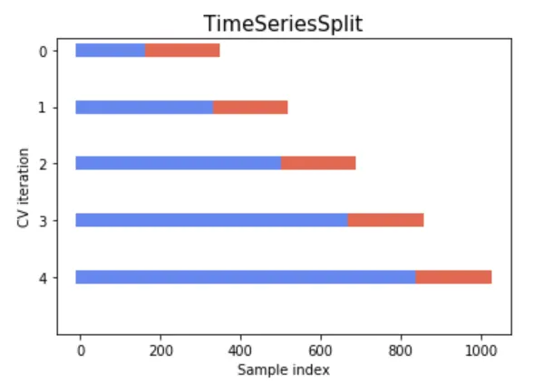
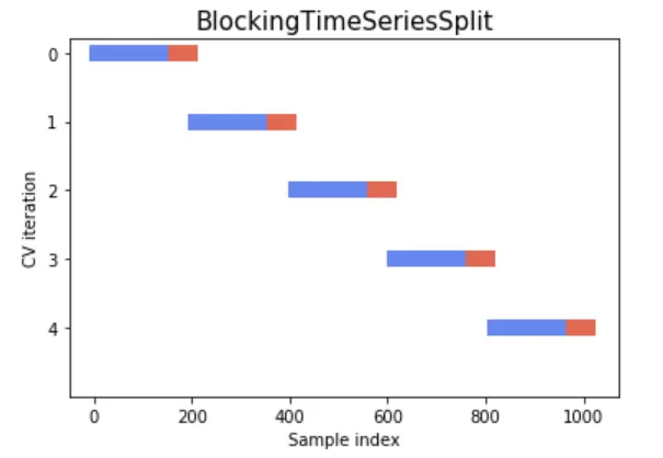
The following figures for understanding and better alignment of split data could be part of the expected output if one could plot it:


References:
-
Using k-fold cross-validation for time-series model selection
-
Cross Validation for Time Series Classification (Not Forecasting!)
from What is the best practice to apply cross-validation using TimeSeriesSplit() over dataframe including visualizing data split in python?

No comments:
Post a Comment